- mamajanemassage
- Apr, 26, 2016
- Birth Doula, Birth Massage, Birth Work, Mama Jane Massage, Pregnancy, Prenatal Massage
- Comments Off on About Mama Jane’s New Logo
About Mama Jane’s New Logo
By Liz Green

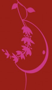
My new beautiful logo designed by Nina Petteys of 602 Creative
You may have noticed that I am in the process of rebranding Mama Jane Massage & Doula Services. I have a new (still in progress) website and new logo – both beautifully designed by Nina Petteys at 602 Creative. Nina and I put a lot of work into my new logo, and I wanted to share how we came up with it. Well, Nina put a lot of work into it, and I provided a lot of opinions.
Previously, my logo was a simple profile of a pregnant woman with a plant branch for an arm. While I liked my old logo and it served its purpose for the past few years, I wanted something new and less common (the pregnant profile appears frequently in doula logos.)

My old logo, lovingly designed by Abby Mae in 2012
When I discussed my logo with Nina, I had a lot of ideas – some reasonable and some bordering on ridiculous in their vagueness – but I couldn’t actually visualize what I was looking for. Generally I was asking for something that represented both my doula and bodywork services, and had elements of nature, trees, water and wind. I seriously said I want elements of “wind.” Whatever that means. Luckily Nina is creative and patient enough that she created about 20 different sketches to choose from, that overall represented my ideas in various ways. In our first conversation I said I didn’t want there to be a pregnant figure, because ultimately it would only represent one kind of person – one race, one body type, one age, one gender expression etc. But after seeing her sketches that didn’t have a pregnant figure I changed my mind. (Again, Nina was very patient.) But I did specify that I wanted the figure to be abstract. My last request was perhaps the most silly of all, because it makes me laugh every time I think of it: I asked for there to be some kind of cervical dilation imagery, like a series of flowers in progressing stages of bloom. Ha!
The logo I finally decided upon is an abstract, hand-drawn spirally pregnant person holding their belly, with a branch/wave extending out from underneath, with metaphorical dilating cervixes blowing in the wind. And it is perfect.


